
Salesforce dashboards are powerful tools that allow you to visualize and analyze data in a meaningful way, enabling informed decision making and better insight into your business performance. Whether you’re a sales manager, marketing professional, or business analyst, building a Salesforce dashboard can help you gain instant actionable insight. Here’s a step-by-step guide to help you build your own Salesforce dashboard.
Step 1: Log into Salesforce Dashboard
Start by logging in to your Salesforce account. Once you’re in, you’ll be able to access all the tools and features, including the dashboard.
Step 2: Navigate to Dashboards
In the navigation menu, you will find the “App Launcher” icon (grid icon). Click on it to open the App Launcher. Then, find and click on “Dashboard”.
Step 3: Create a New Dashboard
Click on the “New Dashboard” button. You will be asked to provide a name and description for your new dashboard. Choose a name that reflects the purpose of the dashboard and add a description if necessary. Click “Create” to proceed.
Step 4: Select a Dashboard Type
Salesforce offers two types of dashboards: “metrics” and “summary.” Choose the type that best suits your data visualization needs. The metrics dashboard allows you to display data in a grid format, while the summary dashboard provides a snapshot of your key metrics.
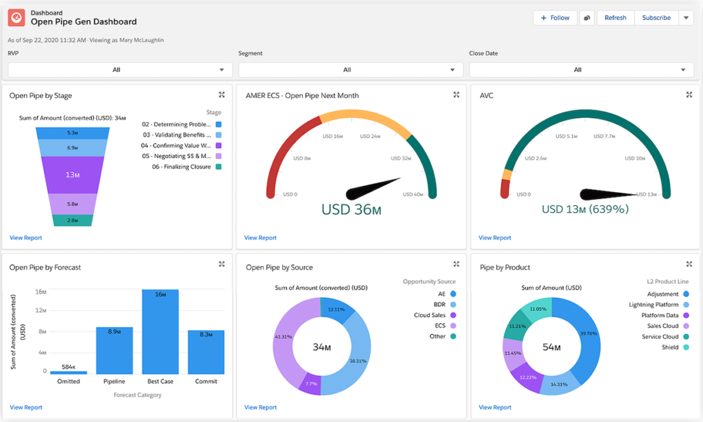
Some Dashboard types for reference :


Step 5: Add Components
Once your dashboard is created, you need to add components to it. Components are individual elements that display data in various formats such as charts, tables, and metrics.
- Click on the “Add” button within your new Dashboard.
- Select the type of component you want to add. You can choose from chart components like bar charts, pie charts, and line charts, as well as table components and metrics components.
- Configure the component settings by selecting the data source (report), grouping, and summarization options.
Step 6: Customize Component Data
For each component you add, you must choose a data source, which is usually a Salesforce report. Select an existing report that contains the data you want to visualize or create a new report specifically for the dashboard.
Step 7: Configure Filters and Parameters
Filters and parameters allow you to control which data is displayed in your dashboard components. You can filter data based on specific criteria such as date ranges, product categories, or regions. This customisation ensures that your dashboard shows the most relevant insights.
Step 8: Arrange Components
Drag and drop components within your dashboard to organize them into a logical and visually appealing layout. Consider the flow of information and the story you want to tell with your dashboard.
Step 9: Save and Share
Once you are satisfied with your dashboard setup, click on the “Save” button. You’ll have the option of saving it to a folder and sharing it with specific users or groups within your Salesforce organisation.
Step 10: View and Interact
Your dashboard is now ready to be viewed and interacted with. You can click on different components to delve deeper into the data, adjust filters to view specific subsets of information, and gain insights that can inform your decisions.
In conclusion, creating Salesforce dashboards empowers you to turn complex data into actionable insights. With a clear understanding of your business goals and the steps for creating a dashboard, you can efficiently organize, visualize, and analyse your data, contributing to better decision making and better business outcomes.
Please visit this article on record types which is a must know for every admin & developer by clicking here.


2 thoughts on “Salesforce Dashboard Creation: A Step-by-Step Guide to Enhance Your Data Visualization Skills | 2024-25”